
I had a blast creating this set of Old Testament character icons, and they will be a great asset and resource on my The Ordinary Adventures of a Primary Chorister blog.
I started the blog several years ago before I knew anything about blogging, code, or graphic design, and in spite of not knowing what I was doing, it was a crazy success. It has been wonderful to connect and share with LDS primary choristers from around the world.
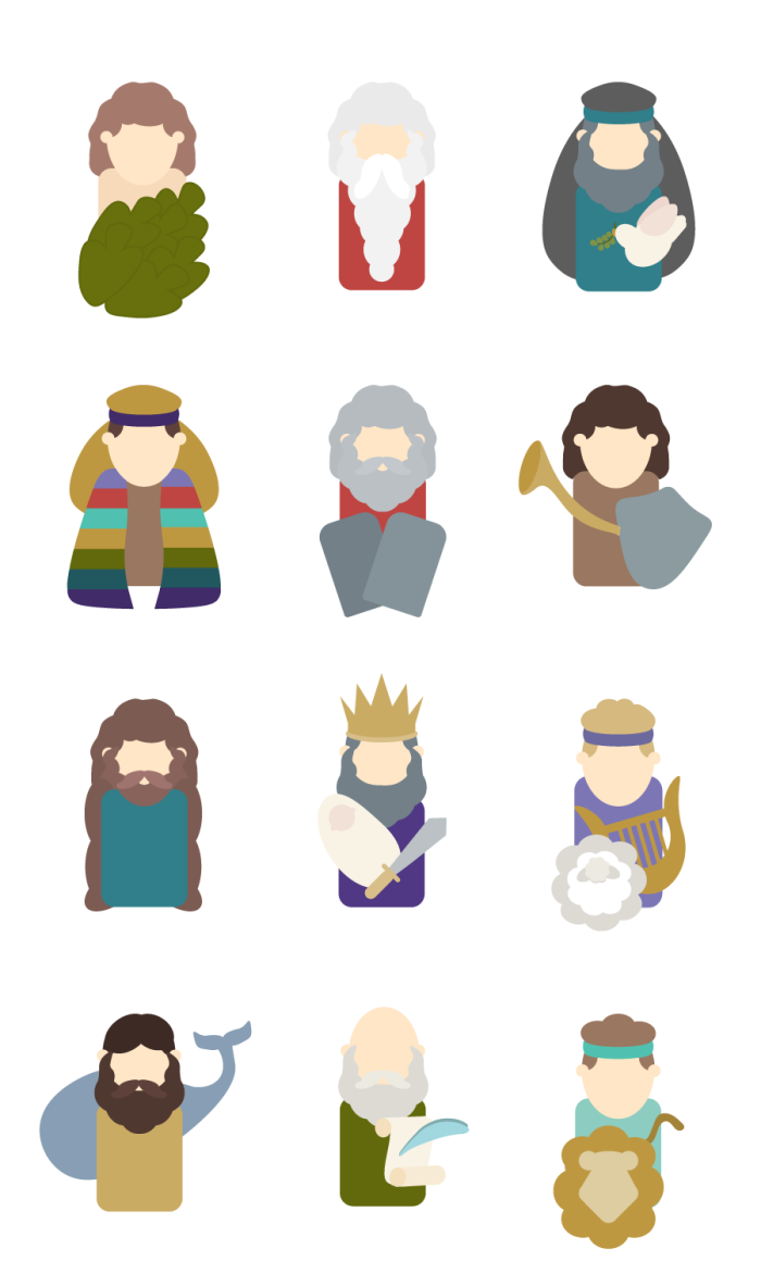
This is the finished product of my icon project:
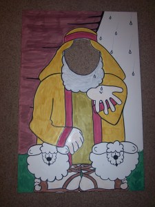
My vision of creating the icon set came from a related project on my primary blog. I made a set of large “Follow the Prophet” posters when I taught the song in 2010, and since then I have had followers of my blog request a pattern, or a printable template they could use to make their own set. My idea was to create a new set as vectors that would be easy to share.
-

- Adam
-
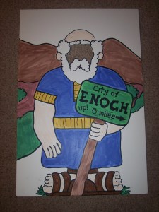
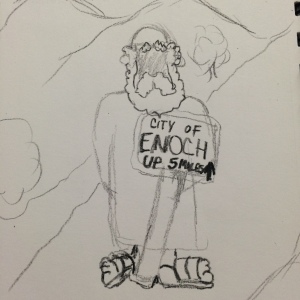
- Enoch
-
- Noah
-
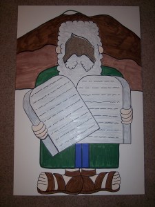
- Moses
-
- Jonah
-
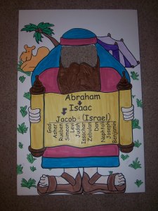
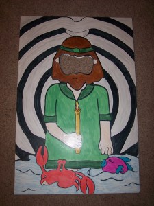
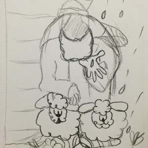
- Abraham
-

- Daniel
-
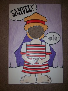
- Samuel
-

- Monson
-
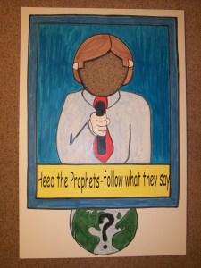
- News guy
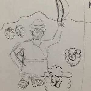
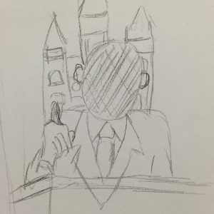
With my goal in mind, I began sketching:
-

- Adam
-
- Noah
-
- Abraham
-
- Ammon
-
- President
-
- Enoch
-

- Daniel
-
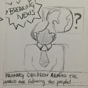
- News guy
Right? They look a lot like my posters. Took me HOURS. My Professor, Cory Kerr explained to me that I was worrying too much about detail into my sketches. He suggested I do the sketches again, but this time, use something – anything – without an eraser (gasp).
Working without my eraser hurt a lot. Seriously. I carry a mechanical pencil everywhere, but I took his suggestion. I started some new sketches using a crayon.
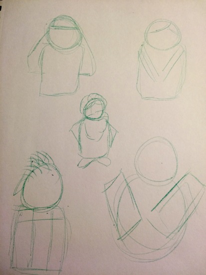
Pretty awful any way you look at them. But the idea was to get me to simplify, and this helped a lot.
Next in the process was a draft made in Adobe Illustrator. This was another painful growing experience for me. I thought I knew what the expectations were. I thought I was heading in the right direction. The draft was supposed to be 90% finished and partially colored in shades of grey. While I missed the mark on the complete assignment, I learned so much about how to use the tools in Illustrator, and the direction of my personal style This is the draft I turned in:
I spend a great deal of time researching and trying to reproduce details like the hands – something I would eliminate later. It wasn’t a waste, because, again, I learned volumes. One of the things my instructor suggested in my critique was that I still needed to simplify. He said I needed to make them look less like “posters,” and more like icons, and he said I needed to be creating the shapes with shapes, not lines. Somehow this clicked, and as I created one, then another, the process began to flow.
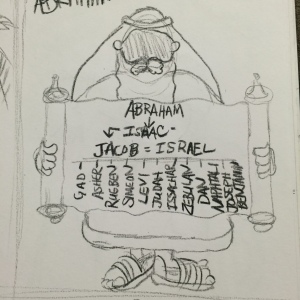
The next hurdle was just in the deciding. Now that I was making icons and not posters, I decided to create only Old Testament prophets, and this was mainly because I want to attract a larger audience. Old Testament characters have a broader audience capacity than say, scripture characters, which might include Book of Mormon prophets.
Next I thought about my color scheme. I wanted bold but not loud colors that blend well. I ran my base colors through Paletton to find just the perfect mix, and this is the color palette I developed:

I didn’t end up using these exact colors, but very close, and creating the the palette gave me even more direction.
I considered adding a stroke to each finished image. Ultimately I decided against it, because i felt it was distracting from the flat, simplicity I had worked so hard to create.

This example shows how each part of an icon is a separate shape:

Finally, equipped with a style, colors, and a better knowledge of my tools, I set out to finish. I am very please with the outcome, and I can hardly wait to create more.
You know, as a mom, I really can’t say any of my children are my favorite, and that’s sort of how I felt creating these icon. With that said, let me just say I definitely became attached to Joseph and his coat of many colors: