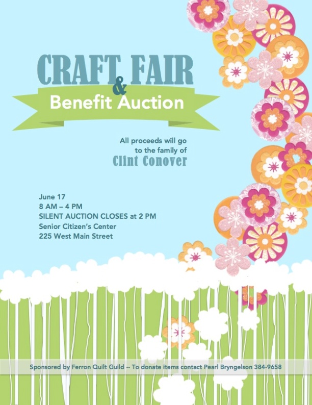
Description: A full bleed event ad to promote a charity event using only Microsoft Word and a scanner.
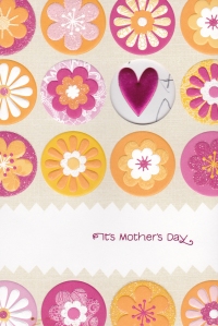
Process (Programs, Tools, Skills): I scanned a Mother’s Day card I received from one of my children. I really liked the flower images and wanted to incorporate them into my design. I used Word Publishing Layout to crop the flowers from my original scanned images. There were a few flower types that were positioned on the card so as to be incomplete. To create a complete flower with these images I duplicated them, then rotated one of the copies to fit perfectly over another. Then I grouped that image. Next I removed the backgrounds of each of the different kinds of flowers I wanted to use with the Remove Background tool under the Format Pictures tab. I wanted a “grassy”effect, so I added a rectangle shape and colored it a complimentary shade of green on the bottom third of the page. Next I used the Line and Scribble tools in the Lines and Connectors tab under the Shapes tool to add white lines to offset the green to mimic grass. I made these lines random thicknesses, and grouped several at a time to be able to duplicate them quickly. For a blue sky effect I created another rectangle shape and increased the size to fit the entire page, then filled it with blue. Next I wanted white cut-outs of my flower images to border the grass and sky. I duplicated one of my flower images and then used the Black and White 25% tool under the Recolor tab under Format Picture tab to make it completely white. Next I duplicated that white flower image several times, and even resized some of the duplications slightly. Next I arranged my graphics to the formation I liked. Then I added a banner from the Shapes button, from the Stars and Banners category. Lastly I added my text in boxes.
Message: This one hits close to home. My little brother was killed about 3 months ago in an avalanche accident in Utah. He was 34 and left behind his wife and five young children. The community rallied together to raise money for my sister-in-law by holding a golf scramble and auction. Many items were donated, even a lasik eye surgery procedure! I’d much rather go to a craft show than play golf, so I decided to recreate the benefit with a craft fair and silent auction sponsored by the local quilt guild. I wanted to send the message that it is a happy, springtime find raiser in memory of my little brother, that would benefit my brother’s family.
Audience: Anyone in the community of Ferron who interested in supporting the family of my brother, Clint Conover.
Color scheme and color names: I used the Tetradic Color scheme with shades of Green, Blue, Red, and Orange.
Most Valuable Skill Learned: I learned how to isolate images and enhance them by removing background color and resizing. Before doing this project I didn’t know that an item could be duplicated by holding the option key and dragging, so that was pretty cool.
Title Font Name & Category: For the title I used Bernard MT Condensed, which is a from the Modern category.
Copy Font Name & Category: For the body I used Avenir Heavy, which is from the Sans Serif category.
Scanned images used, sources, original sizes, location of scanner used: This image is the front of a Mother’s Day card I received from my daughter’s family. If you look at the heart, which is showing through a circle cut-out from the inside of the card, you can see some scribbling where my grandson wished me “Happy Mother’s Day!” It sat on the dining room table for a few days, and if you look closely at the bottom right a food stain can be seen.
I used my home scanner, which is A Cannon MG5400. The original size of the card was 5 x8″. I scanned it at 300 dpi so I could enlarge it and not lose much detail. The final size after scanning is 1203 × 1800 pixels.


Bridgette,
I absolutely love your event ad! The multiple colors in your ad really makes your flier “pop” and gives you a lot of interesting perspective. What I love the most is the flowers falling along the right side of the page. Having the vertical line really “leads” your eyes down through the page as you read the information. Great job!
Bridgette. I really like this design. The fact that you did this all in Microsoft Word is incredible to me. Everything works together extremely well. Your contrasting fonts work well together. It has great flow and hierarchy. Plus, I love the message/cause. I’m very sorry to hear about your loss but I’m glad to hear that they’ve been surrounded by a supportive community and family.
Your feminine design reminds me of http://courtneytietjen.wordpress.com/category/design/ feel free to check her’s out.
Thanks for your kind words Tiffany. 🙂