There’s a fancy name for a person who creates websites on the front end: “Information architect.”
(So totally nerdy – so perfectly me.)
It’s the kind of designing that takes more thought and “trial and error” than you’d expect. But working with a deadline sort of gives me a little rush. You take what you know and apply it, tweak it – twist, adapt and refine until you get just what you want, but as quickly as you can.
Below is my finished page, with notes for the programmer included. The left column is without interaction; the right column shows the navigation bar open on the main page, and a second set of images in the lower pages.

Sketches
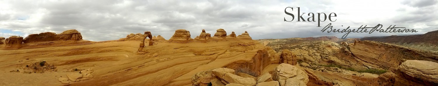
I already had a plan in mind for my sketches. I researched some websites, and found a few that seemed to be my style. Here’s one I modeled mine after:
I started with pencil and paper, and tried not to be too particular. After I had the idea on paper I needed to see it big. REAL BIG – so I drew it on a whiteboard.

Seeing it on the whiteboard helped me decide that I really liked the simplicity of the design on the left.
With that in mind it was finally time to open Illustrator and make a digital wireframe. I tried to make it as much like the whiteboard sketch as I could.
Digital Wireframe
 The idea is to have one large image as the header, which fills up the entire page. A pop-out navigation menu on the left takes viewers to other webpages on my portfolio.
A viewer just needs to scroll down to see the next page, which shows my finished icon project. From there a down arrow icon indicates there’s more to see. Scrolling down again reveals the third page, “Idea.” Here readers will learn about what inspired me to create the Old Testament character icons. There is a widget on this page with a slideshow feature. Arrow left and right icons on either side of the pictures tell the reader there are more images to see by clicking through.
The “Sketches” and “Draft” pages are set up in the same format as the “Idea” page, with slideshow widgets. I chose this format because giving the viewer a large image to view, one at a time, helps direct their attention toward what I want them to see.
The next page is a color palette page, showing the colors used in my icons.
The final page before the footer is a page to show off any other ideas or designs I had along the way, that may or may not have been used in my final piece.
Color and Everything
I found a picture of Mount Everest on Wikemedia Commons that allowed remixing and/or adapting the image, and used it as a reference to create my highlights and shadow shapes with the pen tool.

This file is licensed under the Creative Commons Attribution-Share Alike 2.0 Generic license. Attribution: By shrimpo1967 (originally posted to Flickr as Bhutan Card 02 085) [CC BY-SA 2.0 (http://creativecommons.org/licenses/by-sa/2.0)%5D, via Wikimedia Commons

I tried adding a sunset to the back, and it was pretty cool, just not the look I was going for.

I also thought maybe I needed to simplify, and just create an icon-like image to use as a header.
![]()
It was a fun idea, but the fun died when I remembered I needed to create something to fill the entire first page. I wasn’t really happy with the colors, so I looked to Pinterest for some color inspiration. I liked the two colors of blue in this Shutterstock image, so I used my color-picker extension on my Chrome browser to get just the right shades.

I chose the medium blue in the above image, and then plugged that color into Paletton to get different shades for the entire scene. I also like the deep red in the above image, so I decided to use it for my logo.

For my logo I pretty much had an idea in mind. I used Canva to quickly design my idea.
![]() I brought the Canva image into illustrator for reference. First I opened the shape tool and added a hexagon. For the outer layer/border, it’s the hexagon shape with only a stroke and no fill. Next I used command+c+f to create an exact copy in the front, then made it a little smaller, and made the stroke thinner. I repeated this process for the center layer, then switched it to no stroke and a fill.
I brought the Canva image into illustrator for reference. First I opened the shape tool and added a hexagon. For the outer layer/border, it’s the hexagon shape with only a stroke and no fill. Next I used command+c+f to create an exact copy in the front, then made it a little smaller, and made the stroke thinner. I repeated this process for the center layer, then switched it to no stroke and a fill.
Next I used the line tool to create a dividing line. I changed it to a dashed line with rounded ends to get the dots. Then I added white text above and below the line.

Finally I put the page together:

I am really pleased with the outcome, and hopefully it is pleasing to more than just my eyes.
Now all that was left to do was fill in the empty spaces on my digital wireframe, clean up a few spots, and save.
This was a fun project, but stressful only because of the deadline. Yes, I still work best under pressure, and even enjoy it a little, like I said earlier, but only because I knew I was capable of finishing before the deadline.
