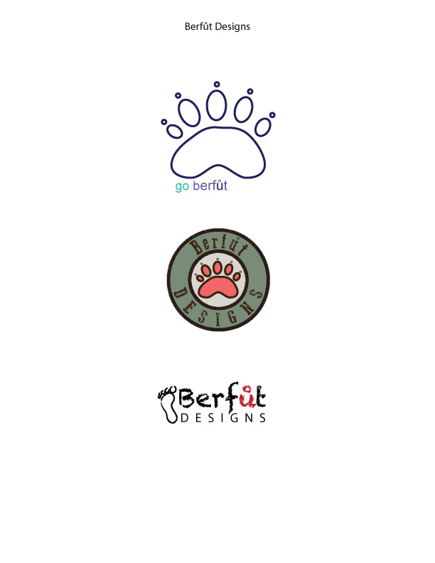
Description: To design three logos for the same company with three variations.
Process (Programs, Tools, Skills): I used Adobe Illustrator. For the top design I began with the ellipse tool to create the pad of the bear paw. I manipulated the edges using the direct selection tool. I also used the ellipse tool to do the toe paw prints, and the little circles (claw marks) above them. Then I just added the text and changed the text color for an analogous color scheme.
For the middle design I copied the top graphic of the bear foot, and filled it with a red shade. I added a circle and used a neutral tan to fill it, then made the stroke really huge, and colored it the green you see. I added a second stroke to the first stroke by clicking on the object, the selecting the Appearance palate, and adding a palate. I colored it a dark brown. Then I added a water filter to the palate, so it had a rough edged appearance. I used the pathfinder to add the text and I was done.
The third design I chose a cute font for the top line, and a more conservative for the bottom, using all caps and increased the tracking to match the upper text. I used the paintbrush tool to trace around a footprint image I found on the internet, the added it next to the text. Finally I changed the U to a brick color.
Message: This is an idea for my own graphic design company. I like woodsy cabin themes, and I like to design while I am barefooted, so I was playing with the ideas of both.
Audience: The audience would be anyone who is looking for a logo design for their company.
Top Thing Learned: I learned how to manipulate the shape tool.
Three Color Scheme and Color Names: The top logo: analogous; middle logo: complimentary, bottom logo monochromatic.
Three sets of Title / Body Font Names & Categories:
Top
Title Font: Sans Serif, Arial
Body Font: none
Middle
Title Font: Decorative, Go 2 Old Western
Body Font: none
Bottom
Title Font: Decorative, Chalkboard
Body Font: Sans Serif, Myriad Pro
Votes on favorite logo: I posted the logos on Facebook and asked everyone to choose their favorite design. To my utter shock, 100 responses came in before the deadline of the assignment. Here are the results.
Top Logo = 7; Middle Logo = 9; Bottom Logo = 84;
Bottom Logo wins!


I loved these! I thought all of them look very professional. I feel like the last one is something that you would actually see in the business world. I like how all of them are all so unique as well. Great job!!
I’m really impressed with these designs and like each of them. The typography on the bottom one is a really good find and goes well with the toes and foot to the left of it. Each of your logos are so unique from each other too. I also like the “u” on the bottom one how you made it red to stand out and have the accent above it to help get across how to pronounce the u like you would in futbol.
Here are my logos for a society I started here:
http://hixstyle.wordpress.com/2014/06/07/project-7-logos/
Bridgette!
I am always so excited to see what you have to come up with, seriously! It is a pleasure to be in class with you and see the work you do, because it is always so good. I can’t decide between the 2nd and the 3rd as to which is my favorite. Okay I think the 3rd one is my favorite, but I just love the contrasting red “u” and the foot as a whole, and altogether they just work very well. Oh and also, I love the contrasting fonts in the 3rd one as well. GREAT JOB, YOU ARE AWESOME!!!
Here is a link to my blog:
http://1jdmoore.wordpress.com/
Also, I really enjoyed this classmate’s blog as well:
http://deannatastic.wordpress.com/2014/06/08/logos-project/comment-page-1/#comment-12
i really like all the work that you do, thats why i keep commenting on all of your projects, because youre such a great example to follow, you seem to understand and grasp the principles really well, great job on the assignment.
heres a link to my blog for anyone thats interested
http://armstrongcomm.wordpress.com/2014/06/07/p5-logos-project/