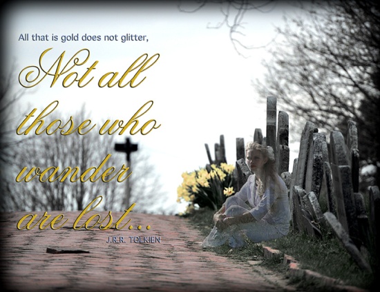
Description: The assignment was to create an inspirational montage combining two or more images, and using typography.
Process (Programs, Tools, Skills, Steps taken while designing):
- After finding my photos I cropped the background image to 8.5 x 11″ then created a duplicate background layer.
- I wanted the edges to look mysterious and blackened, so I created a layer between my original and background layer and filled it in with black. Next I moved back to the duplicate layer and used the rectangular marquee tool to frame the image. Then I selected the inverse, feathered the edges by 100 px, then removed the inverse area.
- I added and adjusted the following layers: brightness and contrast, levels, vibrance, and hue and saturation.
- The next step was to add the image of my sister, Ashley. I used the lasso tool to select her image, then I clicked and dragger her into the cemetery photo. I reduced her size a little and positioned her. I added a layer mask to this layer and then used a soft brush and black paint to soften and blend the edges into the background. Then I reduced the opacity of the layer.
- Next I added the text. To the smaller texts in blue I used the blending options panel to bevel, emboss, and add a drop shadow. To the larger gold text I used the same blending effects as the smaller text in blue.
- The daffodils were pretty brightly yellow and seemed to pull the eye too much toward them, so I dulled the color somewhat by clicking on adjustment, then selective color tool. I also used this tool on the grass. It was too bright for the overall tone of the picture, so I took nearly all the saturation from it. Again I used the selective color tool. I had to repeat this process for the the image of Ashley and the grass around her feet.
- The finishing touches were adding a stroke and an inner shadow to the background copy image. This slightly increased the shadow of black around the edges.
Message: The message can be interpreted a number of ways. I wanted to convey that although we may lose our loved ones they are not lost nor wandering. They are with us and watching over us. The phrase “All that is gold does not glitter” implies that we can not always see things for what they truly are.
Audience: My target audience is anyone who may have lost a loved one, and anyone who is a fan of J.R.R. Tolkien and Lord of the Rings.
Top Thing Learned: I learned how to use layer masking like a boss.
Filter / Colorization used and where it was applied: the background copy image I added and adjusted the following layers: brightness and contrast, levels, vibrance, and hue and saturation. The daffodils were pretty brightly yellow and seemed to pull the eye too much toward them, so I dulled the color somewhat by clicking on adjustment, then selective color tool. I also used this tool on the grass. It was too bright for the overall tone of the picture, so I took nearly all the saturation from it. Again I used the selective color tool. I had to repeat this process for the the image of Ashley and the grass around her feet. I finished off by adding a stroke and an inner shadow to the background copy image. This slightly increased the shadow of black around the edges.
Color scheme and color names: Split Complementary: Gold, Brick, Blue.
Title Font Name & Category: FlemishScriptBT – Decorative
Regular Copy Font Name & Category: Geneva – Sans Serif
Thumbnails of Images used:

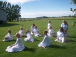
Sources (Links to images on original websites / with title of site): The images used are my original photos. The background was taken in Boston at Copps Hill Burying Ground. The second photo, taken at my home, is of some of my sisters, my sisters-in-law, my mother, and I am in there somewhere, too.


Great job on your montage! I really like the message that you chose, it goes along with the pictures really well. This is a very strong message and I don’t think anyone would miss what you are trying to say once they see it. You did a great job on blending the girl into the background and the color scheme is great also.
http://aricharrison.wordpress.com/category/design/
you, like always did an awesome job on this project i really like the pictures that you chose for this project and i absolutely y like the wording in it as well, but the project as a whole is awesome, you excel as always. great job.
heres a link to my blog for those that want to see it
http://armstrongcomm.wordpress.com/2014/05/31/p4-montage-project/